
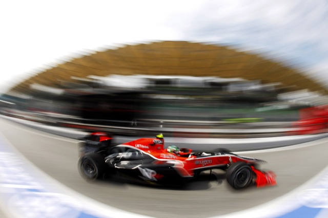
 As I have stated in the past, I don’t really do season review posts as other bloggers do a much better job at these than me. But there is one retrospective question I do like asking, and thankfully it is a question with no real correct answer: Who, in your opinion, had the best looking car during 2007? I like asking this because, to me at least, Formula One is the pinnacle of international motor sport and thus, should be heading the tables in every aspect. Now I know F1 doesn’t always achieve this, but regarding the spectacle of the machines involved, it tends to not do too badly in this area.
So, which one made your jaw drop in 2007? Was it the bling appeal of the McLaren MP4-22, or the interesting livery of Honda’s RA107? What about the moustache-adorned Williams FW29, or the simple-but-effective BMW F1.07? Below is my rank of the ’07 field, but feel free to list yours in the comments at the bottom.
Williams

Once again, the Oxfordshire lads and lasses built a good-looking car and continued their retro-ish livery of dark blue and white. Although it wasn’t the greatest performer, the FW29 had charm and elegance, even when it was missing wing-parts and gear cogs. Something F1 lacks all too often is character, but the 2007 challenger to come from Grove had this in abundance, and to me that sets it aside from the rest of the grid.
McLaren

McLaren almost won last year as well, but again I feel the Woking team should sit behind the Williams. The MP4-22 is pretty with very tight lines and an absolutely gorgeous rear-wing mounting assemble, seen best in Monza trim. The chrome-effect paint job is certainly an area that marks them out among the field, but unlike Williams, the McLaren lacks the distinctive personality that F1 cars should have. To put it simply, it’s a bit too sterile.
Ferrari

Despite the disappointment of the F2007 launch where the car was hardly seen, Ferrari did produce a real looker this year. With tight lines almost equal to McLaren, the Ferrari looked every bit as technical as it did elegant. A change of colour part-way through the year also brought a smile to my face, seeing the Scuderia revert to a more traditional shade of red.
Renault

I remember the launch of Renault’s R27, and the subsequent cries of sorrow across the internet and paper publications. The marque had finally moved away from Oviedo-blue with reference to losing its Spanish driver and tobacco advertising. But while many lambasted the French for going giddy over new sponsors and changing the colour scheme (or throwing it out of the window, depending on your viewpoint), I liked it. The yellow remained, and the dark flourishes were almost retro-like, heralding from Renault’s long history in the sport. The car looked good and almost made up for the lack of pace.
Red Bull Racing

Red Bull have never featured so high in my most desirable list before, so perhaps the addition of Adrian Newey to their design department has done some good. Although the RBR3 spent most of its time stuck in one gear, the brief flashes of speed complimented the now standard livery. Red Bull’s look has never been outrageous (on the track), but the understated colours have grown on me. Coupled with a few ‘borrowed’ nuances from McLaren and the car looked great. They also allowed me and thousands of others to change their livery in aid of charity at the British Grand Prix, raising oodles of money for Wings For Life in the process.
Super Aguri

Super Aguri: Simple. Understated. Based on a known quantity (the Honda RA106). Reasonably quick on a good day. Why go out of town for shopping when sometimes the local shop is equally as good, even stocking the same product at equal price.
Honda

If you can, for just a minute moment, ignore the fact that hundreds of names were printed in tiny letters over a map of the world wrapped around the skin of an F1 machine, you might see that the car wasn’t so ugly. Not underneath, anyway. I remember seeing the RA107 in its now traditional colourless guise during testing, and it was a fine specimen. It’s just a shame it didn’t really go anywhere fast. Oh, and that they painted a picture of the Earth on it.
Scuderia Toro Rosso

STR made a leap forward in the latter half of the ’07 season, perhaps thanks to the adverse weather, maybe even the decline of Super Aguri’s development. But with their new-found success I looked at the car a little differently. I guess it is best described as the Red Bull’s younger teenage brother; loud, lairey, moody and uncontrollable. With mood swings and garish clothes that rebel against its peers, STRs red bull motif has begun to grow on me a tad. Perhaps it is because I now see the comedy-value in the team, what with my perception of them being mirrored by the political shenanigans that dogged them mid-season, but it wasn’t that bad looking, was it?
Spyker

Orange has played a part in Formula for many-a-decade, and that is why I like to see the colour continue to cause upsets with sponsors today. The colour annoys corporate bigwigs because it is so hard to get it to display correctly when being filmed. Sometimes it comes across as red, sometimes pink and other times it can be shown in a sort of mustardy hue. So to see Spyker line up on the grid with an orange motor made me smile. Of all the teams to add an extra challenge to their growing list, the poorest of performers seemed like an unnatural candidate. Another trait the F8-VII follows Williams, and that is character. The car developed a plucky back-of-the-grid personality, and when Marcus Winkelhock led the European Grand Prix, albeit briefly, I couldn’t help but smile. Personality is important, and Spyker transformed the passionless Midland into the happy middle-ground between Jordan and McLaren.
BMW

Like with the Toyota below, BMW have fallen into the corporate hole of blandness. While branding is absolutely vital these days, some manufacturers take it to new levels, refusing to attempt anything outside of the box through fear of causing a monumental crash in sales and reputation. Which is a great shame for the German squad as they had the third best car out there in ’07 and did an awful lot to open up Formula One to the fans. Their ‘Theme Park’ attracted praise from most quarters, but the white cars with blue and red stripes is becoming tired. I would suggest green and pink for the F1.08, but I don’t think my message will be heard.
Toyota

As with BMW, Toyota couldn’t design themselves out of a crayon box. And to add insult to injury, the car was not the performer their budget allows.
Your turn…


Now that’s a sharp comment on the Toyota! But then again, I couldn’t really argue with it 🙂
The Red Bull has been one of my favourite cars since I saw it up close at GPlive. The pinstripes accentuate the curves and it’s a proper beauty.
I admit to gawping at it for quite a while.
I would put the BMW first so, obviously, I disagree with you. And the reason I like it is that you see the car, not the paint job. It’s clean, simple and effective, having all the hallmarks of good design.
Take the McLaren as an instance of paintwork overpowering the look of the car. Concentrate and try to see the car underneath the stupidly flashy colours – it’s positively ungainly and looks out of balance, bent in the middle as though someone very heavy sat upon it and covered in details that only detract from any flowing lines it might retain. A truly awful design that probably needed the silly paint job to look anything like a car at all.
As for the Toro Rosso, I get my cartoons at http://www.comics.com/comics/getfuzzy/ , thanks very much.
Nothing wrong with having an opinion Clive, thanks for sharing. Also thanks to Christine and Alianora.
I must admit, I am considering swapping McLaren and Renault in the list. The more I look at the Reggie the more I like it. I hope it doesn’t change too much now Alonso has returned. And the front of the McLaren was a little messy.
Being a huge Ferrari fan, I am naturally inclined to vote it the best looking car of 2007, but no. My vote goes to the McLaren. It looked simply amazing, especially when seen from the top. Ferrari is a close second. Williams and BMW are my 3rd and 4th. Renault, who departed from their blue and yellow color, traded it for a clownish color scheme. The first time I saw Heikki and Fisichella in their “uniforms”, they looked like they’s escaped the local circus. Honest!! So they’re last. Honda, looks-wise atleast, in my view are 5th. RBR and STR are 6-7, while I’m not particularly bothered about the remaining. So there are my top 8:
1. McLaren (or should I say Fer-Laren?? ;))
2. Ferrari
3. Williams
4. BMW
5. Honda
6. Red Bull Racing-Renault
7. Scuderia Toro Rosso-Ferrari
8. …
9. …
10. …
11. Renault
In complete contrast to your opinion, i would have to voice my complete and utter infatuation with the BMW car this past season.
Unlinke Williams, i believe BMW managed to execute the ‘white balance’ perfectly alongside other present colours on their car. The metallic blue coupled with attractive corporate sponsorship also adding to the attraction.
Sorry to hear of your wrist injury, i do hope it recovers sufficiently, for your sake, as soon as possible. Get well soon.
@Akshay: Welcome back and of course I expected you to go for Ferrari. Well done for holding strong though and resisting the heart! Not sure I agree with the Renault being at the bottom of your list, but I guess their livery was either loved or hated in 2007! 😉
@Jamie: Thank you for your kind words. And it seems as though I’m out in the cold when it comes to BMW – most here seem to rate it much higher than my penultimate last position. At least no body seems to be disagreeing with me too much with Toyota’s placing.
Here are my ratings.
1) Williams – I agree with you that they were the class of the filed as far as looks go. A very well proportioned car with matching colors.
2)Ferrari – I liked the car very much when the switched back to their traditional red. The first pictures of kimi in pre season Ferarri colors made me puke!!
3) Mclaren – I expected their livery to be a lot more different this year than just replace the black oval on the side pods of last years car with vodafone red. But the livery grew on me through the season. I still think the 2005 Mclaren was the best looking car they built in a long time.
4) Honda – Here is a surprise!! I always loved the Jaguar racing greens and they were one of my favorite teams though they never achieved anything! Honda seemed to remind me of the Jag, but I am starting to believe the statement that someone told me at the beginning of the season – “Green colored cars never go well in F1” 🙁
5) STR – I thought the STR’s livery conveyed red bull’s wild, wacky and fun loving image better than the A team. I also thought that the golden colored nose on the STR looked lot more elegant and gelled well with the blue than the shouting yellow of the A team’s car.
6) Redbull – Still, the MClarensque looks and the pinstripes meant it was a good looking car. only not as good as its B team!!
7) BMW – The corporate color scheme was too bland for my taste. Still the car looked OK. I never understood why they never used the turquoise color of petronas in the sidepods. That would look very good with their white and blue scheme if done well. And they have enough white in the car where they can move their BMW blue colors!
8) Spyker – Welcomeback orange to the grid! Alas, a short life..
9) Renault – honestly, they could have done a more thoughtful job than just taking out the sky blue and sticking in the ING colors. Thats a sucking deal!
10) Super Aguri – Their 2006 livery looked a lot more better than this one.
11) whats the eleventh team in F1 called?
Toyota. At least we all seem to agree there!
As for the “green cars never go well in F1”, I would present the Jordan 191 as a counter-example. However, going for marketing over substance was probably what keeled the whole Honda thing over (much as its previous iteration was keeled over by BAT-centric behaviour in 1999).
@Uppili: Hehehe, lol. Eleventh team question. I like your humour. Pleased to see some else likes the recent livery of the Williams, shame we don’t agree on the Renault; you either love it or hate, I guess.
I think, perhaps harking back to Sauber’s days, I prefer a yellow sun rather than a golden sun on the Red Bulls, but I’d have to agree that STR promote the fun-loving fancy-free image better. Still, somebody’s gotta be the boss and act professional.
I like your opinion and comment regarding the F1 designs. While I like the BMW and Toyota teams, I completely agree with you that both cars look boring and unoriginal. I do not agree that Williams is the best looking car as I find the blue, white colors a bit boring too. I love the look of the new Renault and the McLaren though my favorite teams are Ferrari and Honda. Toro Rosso looks too much like the Red Bull car, and I don’t like that even if they are a “junior” team to them. This is how I would rank the look of the 2007 F1 cars.
1. McLaren
2. Renault
3. Ferrari
4. Red Bull
5. Williams
6. Super Aguri
7. Honda
8. Spyker
9. BMW
10. Toyota
11. Toro Rosso