
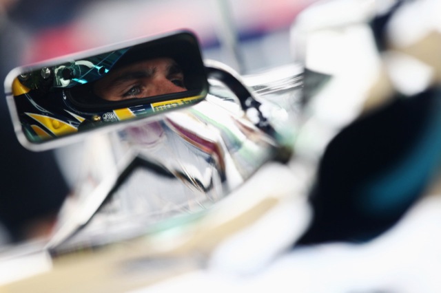
Before Honda owned the team they just about still do, the squad were owned by BAT and were called BAR. The cigarette company purchased the team from Ken Tyrrell, who himself had been a constructor in Formula One from 1970, famously winning the driver’s title with Jackie Stewart on two occasions and the constructors once. Although Tyrrell’s success was never to be repeated with the future owners, Honda did manage a race win in 2006, the squad’s only real triumph since 1999.
However, this post is less about the team’s entry in the record books, and more about the liveries. From 1999 onwards, when BAR first competed, to the last race ran as Honda in 2008. These are the liveries that adorned the cars from Brackley…
1999 – Dual Livery Sparks Controversy
Even before a BAR had been driven in anger, the team were called up before the World Motor Sport Council to explain their actions. The reason for such an occasion centred around the team’s livery presented to the media at the car’s launch. Due to BAT wanting to promote two cigarette brands, one car was coloured red and white, the other blue and yellow.
Unfortunately for BAR, this went against the rules which state both cars must be liveried very similar or identical. The way around this for BAR was to create the zip-livery, whereby one side of the BAR 01 was painted in the colours of Lucky Strike, and the other was painted in the colours of 555 (a zip was placed along the centre to separate the two designs). Needless to say, it was atrocious.


2000 – A More Subdued Livery
BAR dropped the dual livery in 2000 in favour of a more traditional look, opting to promote the Lucky Strike brand. BAT’s 555 brand is more favourable in Asian countries, and as Formula One raced more in Europe at the time, it seemed like the sensible option. Thus, the BAR 02 took on a predominantly white look, with the red circle of Lucky Strike in the sidepod.
The silver flourishes from the BAR 01 were carried over to the second car, this time on the air intake and the lower part of the engine cover. The livery was, in my opinion, a huge improvement over its predecessor. 2000 was also the first time Honda became involved with the team, initially as an engine supplier.


2001 – Setting The Livery Standard
In 2001, BAR set a standard for their future liveries to work by, removing the silver and adding in the khaki and black also featured within the Lucky Strike brand. The car remained largely white and following Jordan’s lead, the team would often change the words of their tobacco sponsor for races that didn’t allow cigarette advertising. “Look Alike” became a popular phrase, used to replace “Luck Strike”.


2002 – Continuing The Theme
The BAR 04 saw little change in the livery. The basic design remained the same and the only differences of note are the orange mirrors courtesy of sponsorship requirements and the slight alteration to the Lucky Strike red circle. Instead of the circle being solid as it was before, the company introduced white bars across one half of it. I’m not sure if this was a company-wide change or just done for the Formula One team. You can just about see the difference in the second photograph.


2003 – Adjusting The Standard
In 2003, the team made a few more changes to the livery, but it largely had the same feel to it from before. More black was introduced on the front wing, and the engine cover took on the red and khaki from the Lucky Strike brand. Honda started to adorn the rear wing with their logo and while “Look Alike” remained, “Lookies” also started to appear on the nose section (“Lookies” being a parody of “Luckies”). During the winter off-season, the team also ran an all-black interim livery on the test car.


2004 – Bar Code Additions
A bar code, or BAR code, was added to the 2004 livery, along with more black on the engine cover, dividing the part into three colours now, with the red and khaki. The bar code featured on the sidepods and included the year, the driver’s initials and the words “BAR CODE”. The rear wing also started to have the words “Don’t Walk” emblazoned on the back of it. The “Look Alike” phrase had been replaced with “Look Left” on the right sidepod cover, and “Look Right” on the left.


During winter testing, BAR ran a black livery.

In Spain, the team ran a livery which included more black on the side.

In Italy, the team ran a livery depicting the driver outlined on the side of the monocoque.

In China, the team promoted BAT’s 555 brand, changing the cars to blue and yellow.

2005 – The Final BAR
The khaki was replaced with black on the BAR 06, and the bar code on the sidepod was made a little smaller, perhaps mainly because of the curved nature of the part on the car. The mirrors changed to black and the rear wing continued to tell following drivers not to walk.


2006 – Honda Take Over
The first Honda, named the RA106, continued BAR’s livery design as the team were still sponsored by BAT and the Lucky Strike brand. The red circle logo received some overdue attention though and was spiced up for the 2006 season. Khaki made a return on the engine cover, the part now displaying four colours. At races that didn’t allow tobacco advertising, the team copied McLaren and used the driver’s forenames on the cars, Rubens and Jenson. “Racing Revolution” became a new catchphrase on the car, circling the Lucky Strike logo and featuring in much of the team’s branded paraphernalia.


The team ran a special livery at the Istanbul Grand Prix, dedicated to their sponsorship with Petrol Ofisi.

In China, the team promoted BAT’s 555 brand, changing the cars to blue and yellow.

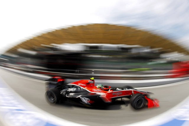
2007 – The Earth Car
A lot of fuss was made of the 2007 livery, set to cover the Honda RA107. Much speculation spread around the motor sport fraternity and when it was finally unveiled at the Natural History Museum in London, people were divided the world over. The reason for the interest was down to the team no longer being sponsored by BAT – thus, the design was about to change.
I think most didn’t like it, but the scheme did have its fans. Using a graphic of the world, very similar to Google Earth’s (but not actually Google’s), the car was pretty much sponsor-free. Instead, the team promoted green causes and even got people to sign up to make a pledge towards reducing their carbon footprint in exchange for getting your name printed on the chassis. The names were very small, but “Oliver White – BlogF1” is on that car somewhere. The team also ran an all-black testing livery over the winter.


2008 – Earth Evolved
With a general mockery made of the Earth car and its flawed green appeal, the design was toned down for 2008. Gone was the all-covering earth design and the RA108 reverted to a much more white livery. The Earth graphic was still included, but substantially less in your face. The RA108 also featured flourishes of red once again, a homage to the teams Japanese roots. Stripes were incorporated (along with other teams as well – it must have been the year of the stripe?) and the car’s design was a lot more edgier.
Unfortunately, the team were less than successful and after the season climax, it was announced the squad were to withdraw from the sport. The hunt is on for a buyer, but failing to find one will mean the team being disbanded. Ladies and gentlemen, the last Honda. For now, anyway.


In the previous livery posts, there were comments made about teams not really needing to spend a great deal on their graphic designers who come up with the liveries. Perhaps these were due to Toyota never really making any substantial changes to their liveries and Renault changing, but for the worse each and every time. However, BAR spent a fair amount of time on their liveries, designing more than their fair share of one-offs over the years. If any team deserves an award to trying, perhaps BAR should stand up and collect it.
Images © HondaF1.


There are more one-off liveries, so please remind me in the comments. Also, I am fairly certain that the team did manage to run two different liveries at one race (Lucky Strike and 555), but can’t for the life of me remember when. If you have a photograph/link, please let me know below.
i (heart) these posts ollie. thank you 🙂
Pleased as ever to provide. I’m still working on the Williams mega-monster livery post, and am now considering a Jordan tribute. After all, Eddie set the trend for many with his tobacco acronyms, not to mention the snakes, sharks and what-not.
Great job, Ollie! Keep going with these posts! Hope to see a Ferrari one soon. 😀
Anyway, going back to BAR/Honda, I remember them creating a nice little touch – at the back of the sidepod winglets, they put a design of their specific driver’s flag – such that if Button were driving, for example, you’d see his flag on both winglets. You’ll see them through the default onboard camera – I guess it helped the team identify which driver they were watching.
It’s on the 2006 DVD, if I’m not mistaken. One of the onboard laps, methinks. 🙂
[…] BAR’s & Honda’s Livery Developement: 1999 – 2008 – BlogF1 […]
Extremely unhappy for Honda, the team was second to Ferrari in 2004 and could have well become champion, the clean white livery was nice, god knows why they turned to the slimy green earth dreams scheme, the car, the team and the drivers got a setback…
Bad for Rubens Barichello, and more bad for Jenson Button, who could well have become a champion before Hamilton..
I think the best ones Honda/BAR had in 2005/2006. That’s one of these amazing colour-shemes traditional F1 Fans would like most… The old colours from Hondas F1-Engagement in the 60s combined with a very modern design, especially that 2006 “Racing Revolution” red circle. I really liked it, even if I think the 2005 car itself looked nicer in it’s form.
I also liked the Earth-Car when I first saw it, I think it looks amazing on white background… the colours were really bright and great to look at … just the problem, the car on track never looked that good. The second one, as I already said in another topic, looked alot better on track, it just should have had more red stripes on it – mostly the fins on the front wing would have looked great with it and also the long fin behind the airbox instead of the circle around it (which looked terrible idealess in my opinon).
05 and 06 were classic liveries – they never should have changed them.
Good riddance Honda, you were a waste of space and for the third time you quit because the sport was too difficult for you.
Thanks Journeyer. I do hope you’re joking about wanting a Ferrari one – I fear that post could develop into a site all unto itself! 🙂
I didn’t notice that. I’ll have a look around and see if I can find a photo.
I agree. Some say Honda won’t be missed, but I think losing a team is bad for the sport, whether you support them or not.
Indeed. I forgot to mention that old Hondas from the sixties were white – it was Japan’s national racing colour, like British Racing Green and Rosso Corsa for Italy.
Or raced well. I know this post is about the liveries, but if a car performs well then many sins-in-design are hidden. Gonna be interesting what we all think of the Renault livery at the end of the year…
Don’t beat about the bush, Gavin. Just come right out and say what you think! 😀 Although I thought it was only the second time they’ve quit as a constructor, and the third as an engine supplier. The aborted 1999 attempt never made it to the grid, so I think it’s a little unfair to say they quit, considering they never really got started. Interestingly though, the ’68 and ’99 withdrawals were both because of the death of someone close to the project. The ’08 withdrawal was because of finances.
Another great analysis Ollie. Unfortunately for Honda, I think the livery design peaked in BAR’s final year. Maybe they took the creatives with them, 2006 was an evolution and then it was Blearth Car!
It’s a shame really that Honda bowed out on the worst livery of them all. Of them all, I do quite like the Spanish GP 2004 one
Cheers for the comment Ollie.
Just for the record, I wasn’t thinking about the ’99 car – it wouldn’t be fair to include that as it never raced due to the lead designer passing away.
The ’68 effort was going very well until their driver died. In those days that was a more normal occurrence and I don’t think it’s a very good reason to pull out – Lotus didn’t pull out when Jim Clark or Jochen Rindt died and neither did a lot of other teams.
The Engine withdrawal was simply because after 6-odd years of dominating the sport they started losing and for some reason didn’t want to continue. The 2008 withdrawal was officially due to finances, but really we all know that the car has been rubbish for years and Honda couldn’t spare the embarassment any longer.
So we have a manufacturer that quits every time they stop winning – and each time leaving a lot of people in the lurch. I don’t agree with how they have historically run their teams and I don’t feel that they are loyal enough to have added any value to the sport. Therefore I think they are a waste of space and I hope someone buys the team and turns it into a winner just to show that the boys at Brackley can do things right 😉
Great post Ollie, a joy to read 🙂
I like pretty much all of the Honda liveries, but I think my favourites are the 05/06 cars, plus the special livery for Italy ’04. I also liked last year’s livery, it just appeals to me, okay the car was rubbish but at least the livery looked better than ‘ 07 😉
If you’re referring to Jenson’s win, it was 2006 not 2005 😉
Oh yeah. I lose track when I have to think back more than twelve months. 🙂
for me the best were the 2004 – 2006 liveries. those cars had the race car look. 2007 was horrible, 2008 a bit better 🙂